Barça showcase their own typography, FC Barcelona Play
- Viber
- Messenger
- Copy link
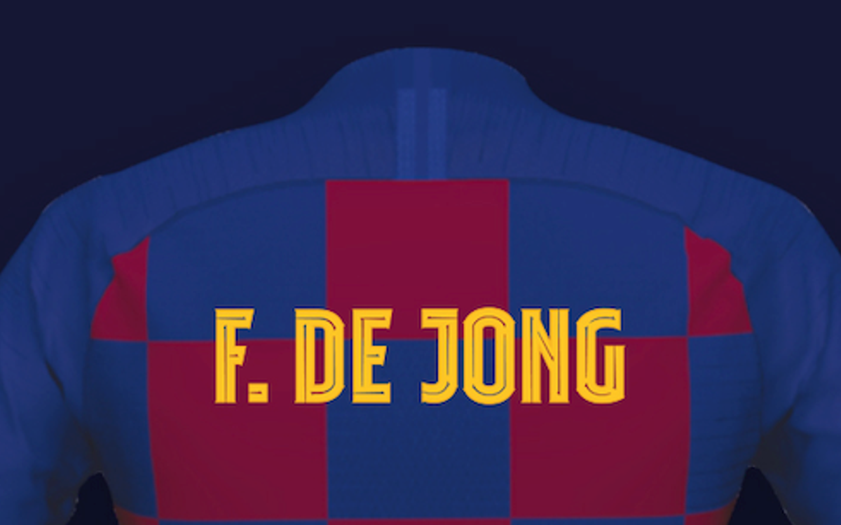
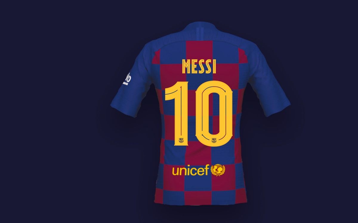
From season 2019/20, Barça will have their own typography (a design of letters and numbers), called FC Barcelona Play, which stands out for being more expressive. The intention is for it to become a new identification element of the club, known for its personality and uniqueness. The new typography, which has already been seen on the shirts of the new signings in the different professional teams, is the result of a creative process that has taken into account the history of the club to the brand story and the need to have a strong graphic character, whilst at the same time owning a creative expressiveness that is recognisable and can be identified with Barça.
The new typography will be present in different media, from communication campaigns of sporting events and merchandise to the backs of the shirts, across all of the professional teams at the club for the 2019/20 season when the regulations so permit. Thus, players from the first team can wear FC Barcelona Play on their jerseys during friendly matches (summer tour, Joan Gamper Trophy), in the Copa del Rey final, and in the Champions League, but they will not be able to use it on shirts that will be used for LaLiga matches. The first game in which the players from the first team will be wearing this new typography will be in Tokyo on July 23, when Ernesto Valverde's team face Chelsea on the Japan tour.

This is how the players' names will look on the new shirt
Barça Women, Barça B and the basketball, handball, roller hockey and futsal teams, as well as their youth sides, will also use the new typography in their friendly matches and official competitions.
In addition to usage on the shirts when permitted by the regulations, the new typography will also be applied to sporting campaigns, as well as in the retail and merchandising area of the club.
This is the first time that Barça has driven the design of their own, new typography, although in previous seasons the shirts had different designs developed by Nike. When the club recovered the rights of the retail and merchandising business just over a year ago, through the BLM (Barça Licensing and Merchandising) company, it considered it necessary to promote initiatives such as the creation of a typography of its own which ensured the promotion of the Barça brand and to favour its global expansion. At the official Barça Store, the shirts can be customised with this new typography.
The creative process
Conceptually, FC Barcelona Play is a typography based on the origins and history of the club, Catalan modernism in the late nineteenth century and specifically relating to the direct link between Barça and the current artistic and aesthetic trends in the city of Barcelona and Catalonia. The intention was that each word written with the typography had its own personality and ability to have variants.
Once the typographic base was defined, the creative process introduced its own elements that make Barça a unique and different club, such as the style of play. Thus, the new typography includes traces that suggest movement and dynamism, and a wink to the movement of the ball.
- Viber
- Messenger
- Copy link

